


📦 Re-designing a setup guide to enhance customer unboxing experience
PROJECT OVERVIEW
ROLE
The goal of this project was to identify any usability issues associated with the Quick Reference Guide (QRG) such that appropriate changes could be made to ensure a user-friendly, intuitive unboxing experience.
A customer’s first hands-on-experience with the product is having to remove the bike from a large box which includes in addition to the bike - the pedals, a charging cable, tools for assembly and a Quick Reference Guide (QRG) that provides all the necessary assembly steps.
Prototyping and Testing, Visual Design - Responsible for conducting usability testing, updating the information architecture and visual design of the instructions methods
IMPACT

-50%
Total Setup Time

+200%
Task Completion Rate
BACKGROUND
The Problem…
To stay competitive in urban mobility, GM developed an eBike for customers who don’t rely on personal vehicles. Sold online and delivered to homes, the product required a clear Quick Reference Guide (QRG) to ensure a smooth unboxing and assembly experience.
To validate its effectiveness, we conducted usability testing with 14 participants over two days.
THE PROCESS
Our goal was to mimic the true unboxing experience a customer would have after purchasing the bike
To ensure realistic testing, we recreated the intended customer experience by having 14 GM employees from diverse backgrounds unbox and assemble the bike as if it had been delivered to their home. Each participant had a one-hour session and was asked to think aloud during the process, while our team recorded observations to capture their unboxing experience using the prompts below:
Unboxing & App Pairing
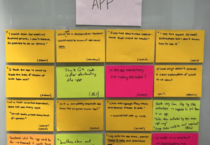
Observe how the user follows app instructions. Note: App is not available yet, so we'll have the user talk through what they would do for downloading and pairing
Do they know what to do with the QR Code?
Is it clear what the app is used for?
How seamless is the experience to pair their bike and device
Kickstand
Observe how the user follows the kickstand assembly instructions
Is the user able to easily locate and operate the kickstand?
Battery Charging
Observe how the user interacts with the battery and charging port
Is the user able to successfully identify battery charging port location
Handlebars
Observe how the user follows the handlebar assembly instructions
Does the user recognize the need for a clearance gap in the handlebar assembly?
Foot Pedals
Observe how the user follows the foot pedal assembly instructions?
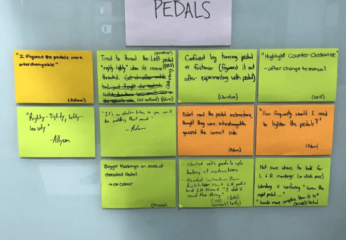
Is the user able to distinguish between the left and right pedal
Does the user recognize that the pedals are reverse threaded from each other?
OBSERVATIONS & INSIGHTS
Using affinity diagramming we were able to group insights into common themes.
While one person from the team was in the room with the participant, two others were in another room affinity diagramming observations in real time. These observations are documented in the slideshow below:


After the first round of testing was completed, our team identified the main issues to be:

Fastening the Pedals - The QRG fails to explain that the pedals are reverse-threaded and must be installed in opposite directions. Many participants tried fastening them incorrectly, risking permanent damage to the crank’s aluminum threading.
Handlebar Clearance Gap - The QRG lacks guidance on maintaining a small clearance gap to ensure smooth handlebar rotation. Without it, metal components may grind against each other, leading to reduced performance and long-term wear.
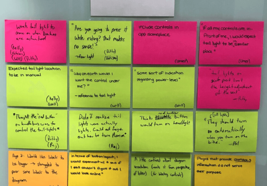
Bike Controls - Participants consistently emphasized the need to separate bike and app controls, noting that “not everyone is interested in app features and they seem like a requirement when included with bike controls"
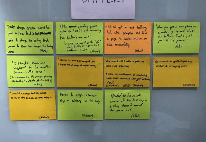
Battery Charging - The original QRG made no mention of how to locate the charging port or any instructions at all regarding how to properly charge the battery leaving users extremely confused on whether the bike had to be charged at all.
RAPID PROTOTYPING
To address these issues, we prototyped a modified version of the QRG with updated instruction methods and graphics.
After the first testing round, I used Figma to create a revised QRG that addressed key issues. The updated version prioritized clarity and focused on essential information. Design changes and their rationale are summarized below:
Bike Controls
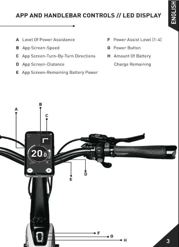

ORIGINAL
UPDATED
🚩 PROBLEM: The original QRG poorly communicated basic bike controls. Mixing app and bike controls caused many users to overlook key info, especially those uninterested in the app.
💡 SOLUTION: Separate bike and app controls into different pages to clarify that the app is optional. This prevents non-app users from missing essential bike instructions and allows for a more detailed, focused explanation of bike controls without added distractions.
Fastening Pedals

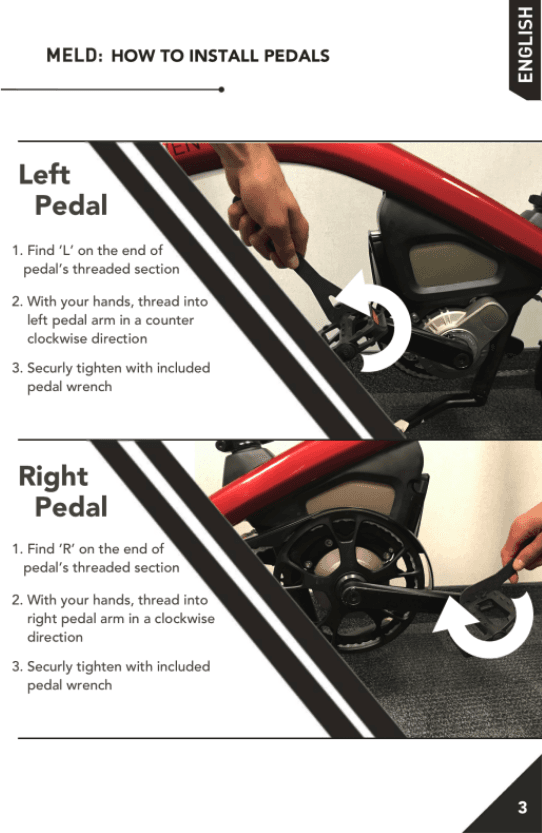
ORIGINAL
UPDATED
🚩 PROBLEM: The original QRG failed to mention that the R and L pedals are reverse-threaded and must be installed in opposite directions. Many users tightened both clockwise, risking damage to the bike crank.
💡 SOLUTION: To reduce confusion between left and right pedal instructions, I split the content into separate sections. Though slightly redundant, I believed this approach would minimized user error. I also added clearer photos, directional arrows, and explicit instructions for correct wrench rotation on both sides.
Handlebar Clearance


ORIGINAL
UPDATED
🚩 PROBLEM: The original QRG omitted the need for a clearance gap between the handlebars and front fork, causing metal-on-metal contact that restricted smooth handlebar rotation and made turning difficult.
💡 SOLUTION: To allow smooth turning, a 5mm gap is needed for friction-free handlebar rotation. To highlight this, a new instruction was added specifically addressing the required clearance (see step 2 in the updated image).
Battery Charging
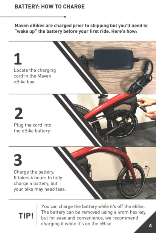
UPDATED
🚩 PROBLEM: The original QRG lacked any information about the battery—no details on the charging port location, charging time, or battery removal. As a result, users were confused and unsure if the bike even required charging (spoiler: it does).
💡 SOLUTION: To reduce confusion, I added a dedicated battery info page showing the charging cord, port location, and estimated charge time. The goal was to highlight the battery’s importance and ensure users know how to charge it properly.
DESIGN VALIDATION
Day two of testing focused on evaluating five key benchmarks using the modified QRG
Ability to successfully identify all bike controls
Ability to locate battery charging port < 2 min
Ability to properly activate kickstand
Ability to consciously recognize need for handlebar clearance gap
Ability to consciously recognize left pedal is reverse threaded
TESTING
Testing revealed a significant increase in participants attention to the five key benchmarks
On day two, we tested six new participants using the same exercise as day one, this time with the updated QRG. Since they hadn’t seen the original guide, their feedback was unbiased by prior experience.
The chart below compares results across the five key benchmarks from both testing days:
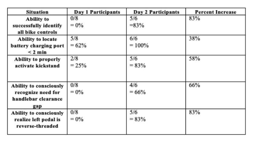
We witnessed a significant increase in a participant’s ability to recognize each of the major benchmarks using the modified QRG. Additionally, total average setup time decreased by 50% and task completion increased by 200%.
While the results were extremely encouraging - it is important to recognize that the sample size is still quite small so I think the first step should be conducting a greater number of tests with both versions of the QRG to see if these patterns continue.
TAKEAWAYS
What we learned…
Always test. If you try to design a product without any consideration for your users and how they will interact with your product - you will get it wrong. Design is a constant iteration of improving the experience for the end user. Always find ways to collect and listen to your user’s feedback.
Include design early and often. What was scary about this project was the fact that our test team wasn’t brought in to help until it was almost too late, until the only thing that could be changed was the QRG. It highlighted the importance of having the engineering and design teams working together throughout the entirety of a project.
Prototype to learn. We were operating on a very tight timeline when prototyping the updated version of the QRG, worrying about the exact details of things could have severely ate up valuable time. Focussing on providing just enough detail for us to learn something about how the changes made impacted our users was key in having a testable solution for the second round of tests.
© 2025 Steven Nydam