


MOBILE APP / END-TO-END DESIGN / B2C
🧗 Improving the route discovery experience for outdoor climbers
PROJECT OVERVIEW
ROLE
Mesh is a mobile-based platform designed to improve the route discovery experience for outdoor climbers by providing them a way to virtually explore routes and regions as well as communicate and share information with other local climbers.
This platform was created for my fourth-year engineering design capstone project working with a team of 4 interdisciplinary engineering students.
Lead Product Designer - User Research, Interaction Design, Visual Design, Information Architecture, Usability, Prototyping & Testing
IMPACT

Enhanced Route & Region Exploration Experience
Helping climbers find new routes using photospheric images to display high-quality route visualizations

Helping Climbers Make Safe Climbing Decisions
Including digital markups to communicate evolving route conditions and keep climbers informed
Community Route Grades
Allowing community input when grading routes to remove subjectivity and inconsistency from official grades
THE PROCESS
As the lead designer it was my responsibility to define the process our team would follow for the project. I decided to base our approach off the Interaction Design Foundation’s Design Thinking Process in order to tackle an ill-defined problem by understanding human needs, brainstorming many possible solutions, and adopting a hands-on approach in prototyping and testing.

EMPATHIZE
User Interviews revealed that the route & region exploration experience was a major pain point for climbers.
By conducting exploratory user interviews with 10 climbers of varying experience levels, and then synthesizing our insights, we came to understand that fundamentally, all outdoor climbers need a way to:
Explore and learn about existing climbing regions and routes
Communicate and share information about newly developed routes, and any potentially changing aspects of existing routes (i.e. loose rock features, worn down anchors) for safety purposes when climbing
Outdoor climbers rely on two primary methods to meet these needs - guidebooks, and digital tools; however, these methods fall short in a number of ways.

We started with a competitive analysis to explore & learn about the e.
We started with a competitive analysis to explore & learn about the current solution space.
Common climbing-focused information platforms included in the analysis were 27 Crags, Sloper, Rakkup, Mountain Project, theCrag, Vertical Climbing Life and a variety of traditional Guidebooks.
By evaluating the unique value proposition, strengths, weaknesses and focus area of each competitor we generated the following key learnings:
Different regions rely on different platforms
Community driven platforms typically only get quality information in popular areas
A select few users (1%) contribute most of the information (99%)
Web app platforms typically have more in-depth information, but lack photos, while mobile apps have the opposite
Topo map providers give rich context to the surroundings but lack connection with route/crag level information
DEFINE
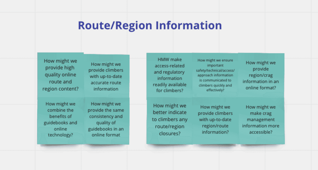
Brainstorming problem statements based on user research insights.
I facilitated a workshop where each member of the team brainstormed “How Might We…” (HMW) statements which identified areas of opportunity where a user need is not currently being met by existing solutions. We then affinity mapped our statements into common themes.


Prioritizing problem statements by comparing impact and satisfaction
Prioritizing problem statements by comparing impact and user satisfaction with current solutions.
Each HMW statement was then plotted on an impact-satisfaction matrix to identify which problems are considered most important, and currently aren’t being addressed by existing solutions. Any problem that wasn’t of significant importance was simply left off the chart.
Importance of problem was determined using insights from our user interviews
Satisfaction with existing solutions was determined using insights from competitive analysis

Drafting personas to gain an understanding of how the needs of climbers differ based on the climber's discipline.
Another thing we had to consider was the impact of a climber’s discipline on an identified need. For instance, a multi-pitch climber would require more information about the approach/descent of a climb than an outdoor sport climber or boulderer.


The Problem…
Combining what we learned from our personas and problem statement prioritization we can identify the problems climbers consider most important, that aren’t solved well by existing solutions:

Route and Region Visualizations - Climbers have a frustrating experience exploring routes and regions due to poor route and region visualizations making it hard to discover new climbs
Evolving Conditions - There are no attractive ways to communicate and share reliable, up-to-date information about evolving route conditions which poses a huge safety risk
Inconsistent Route Grading - Route grading is very inconsistent and largely subjective which presents another safety concern
IDEATE
Using Crazy 8s and Vignettes to generate a large number of possible solutions — fast!
Each member of the team completed a crazy 8s exercise using the identified problems as a foundation for ideation. Each member then chose 2 of their most promising ideas from the Crazy 8s exercise and created “vignettes” that consisted of a visual representation of the idea and some supplementary details. The vignettes were then presented to the group.


During the presentations additional features/ideas were shared that built on top of the original solutions and were recorded on sticky notes. We then dot voted to determine which concept we felt best addressed the identified problems.
Here is the idea we chose:

Mesh - The use of image stitching to construct photospheric images of rock walls and surrounding crag areas to enhance the route visualization experience for climbers
Our Hypothesis… high-quality route and region visualizations = climbers better equip to find and explore routes in a safe manner.
Rationale for photospheric images:
We could leverage existing photosphere viewers (i.e. Google Maps Street view) to quickly assemble a prototype and receive feedback on solution effectiveness
Technically feasible given our group’s knowledge of image processing
Mark-ups could be added to the photospheric images to communicate safety hazards / evolving conditions
Potential to host these images on a climbing platform where other route and region details are shared (i.e. route grading, access instructions, reviews)
PROTOTYPE
Starting with wireframes to establish the basic structure and functionality of the Mesh platform.
As a group we felt satisfied with the defined functionality and user flow outlined by the wireframes so I was given the green light to head into Figma and push some pixels around to improve the overall fidelity of the platform before we began testing.
My focus was to provide additional context to users by adding colour, text, and iconography.
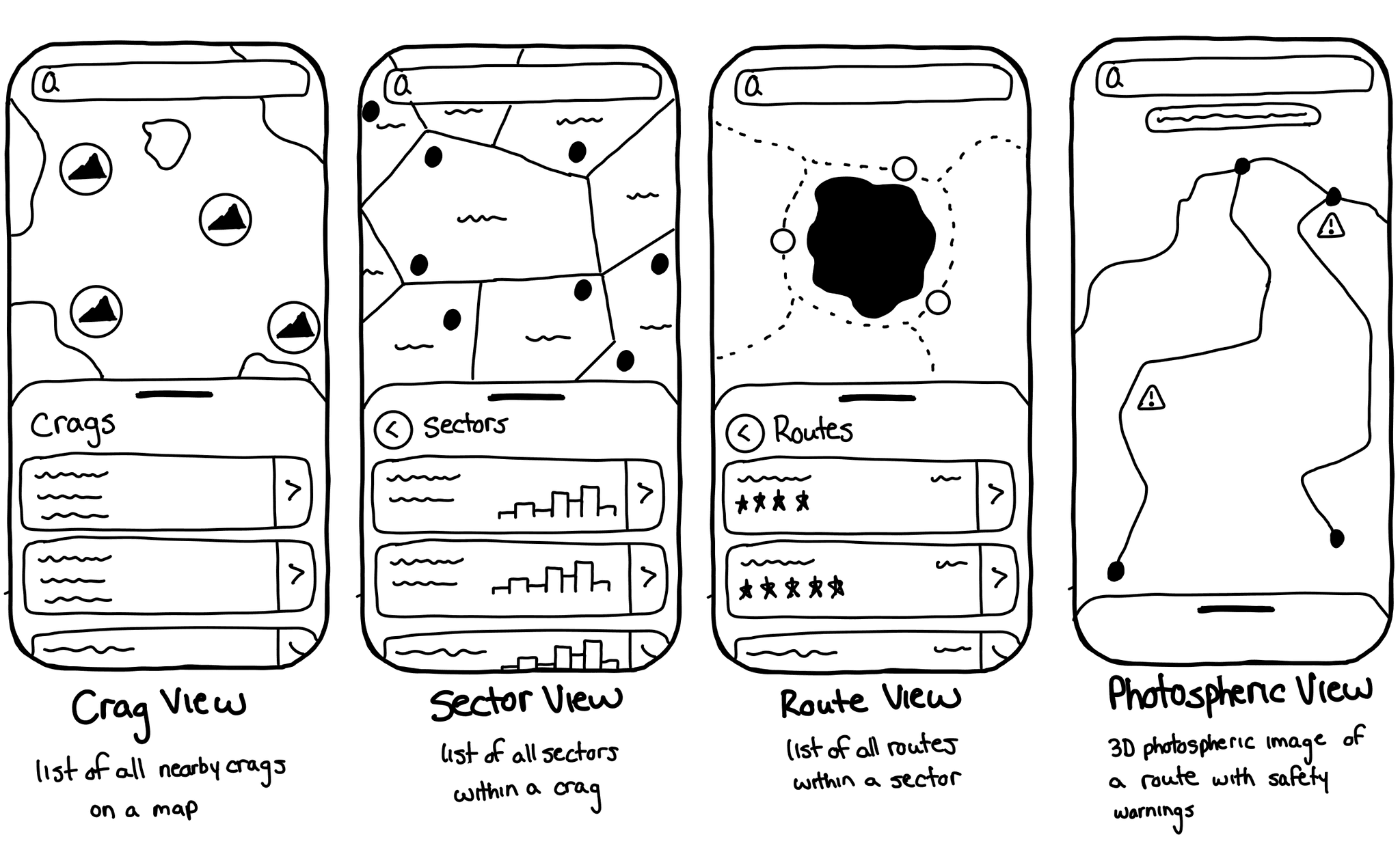
First Iteration Prototype
Crag View
Sector View
At the furthest zoomed out level climbers can see all nearby crags, what type of climbing can be found at each crag, and how far away the crag is. This allows climbers to find new places to climb based on their preferred type of climbing.
Zooming into a crag reveals the breakdown of sectors within that crag, how many routes are in each sector, and the distribution of route difficulty. This allows climbers to decide if the crag has routes appropriate for their experience level.


Route View
Photospheric View
By zooming into a sector users can view the individual rock walls within the sector, a breakdown of the routes on those rock walls, and photosphere icons where an image of the wall can be viewed.
Clicking a photosphere icon displays a high-quality photospheric image of the wall and mark-ups showcase route paths on the wall as well as safety hazards. This gives climbers the ability to explore new routes and stay up-to-date on changing route conditions.


Crag Details
Route Details
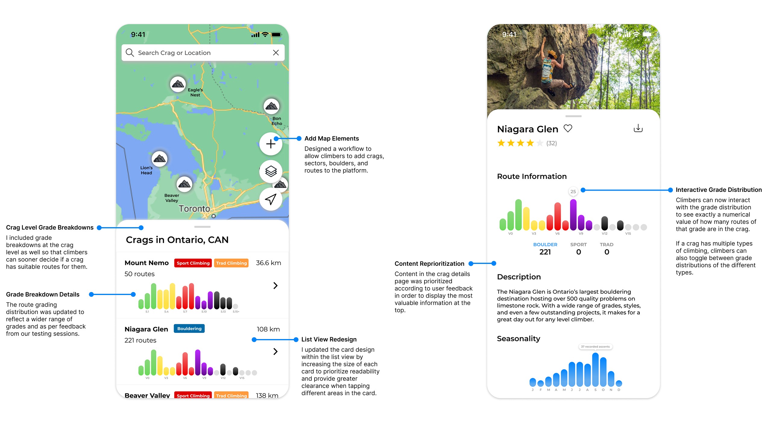
Users also have the ability to view additional details about a given crag such as relevant photos, access instructions, seasonality, etc.
At the route level, climbers can view additional details such as route grade, reviews, first ascents, and route description. To address the subjectivity of route grading we incorporated a community grade in addition to the official grade to factor in the opinions of all who have completed the route instead of a single climber’s opinion.


TEST
First Iteration User Testing
User testing was conducted with 6 climbers of diverse experience levels and preferred types of climbing. Each participant was presented with the prototype and asked to complete a series of tasks relevant to the scenario of planning a climbing trip.
What we tested:
Do high-quality photospheric images make it easier for climbers to virtually explore routes & regions?
Does the use of route mark-ups help communicate evolving route conditions?
Is it easy for users to interact with the map view to find and explore climbing regions?
Does our platform help climbers make safe and informed decisions when climbing?
What we learned: Our solution was validated… but the UI needed some changes.

Photospheric images - Climbers from all disciplines found the use of photospheric images to provide high-quality route visualizations extremely helpful when exploring new routes and regions
Route Mark-ups - Many climbers mentioned how useful mark-ups are for displaying up-to-date route information, enabling them to make safe and informed choices when climbing
Familiarity of Map Interaction - Due to its familiarity with existing products like Apple / Google Maps, climbers loved how intuitive the map interaction felt zooming into different climbing regions and seeing the content in the list change accordingly

Route Rating - There was very minimal context provided around route ratings in the current UI, users were unsure of how to rate a route, and it wasn't clear how many ratings a route had received
Grade Breakdown - Climbers didn't like that the grade breakdown wasn't shown till the sector view, they wanted to see a grade breakdown at the crag view to help them decide if a crag is worth exploring
Crag Details - The content in the crag details page needs to be reprioritized to reflect the most important information at the top (ex. grade breakdown closer to the top)
Second Iteration Prototype
Since the testing from our first iteration prototype confirmed our hypothesis, the focus for our second iteration was making the necessary design updates to improve platform usability and user experience.
To view the entire prototype click here.
Crag View
Crag Details
Route View
Photospheric View
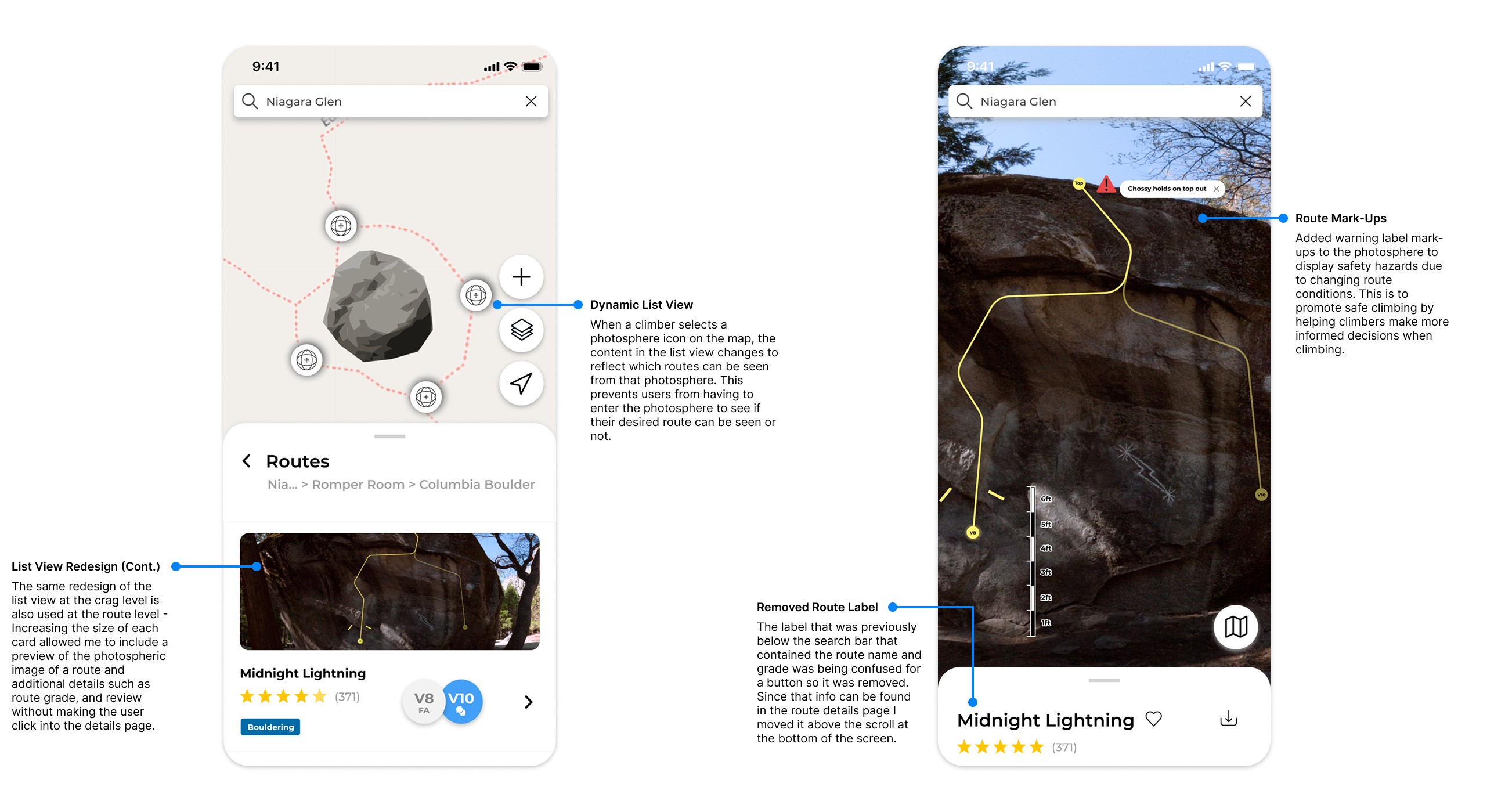
Route Details
Route Details - Climber Reviews

DEVELOPMENT
Here's a peak into the development of the Mesh platform!
As the lead designer, development was not my primary focus; however, I did want to showcase where our team got to in the development cycle by the end of our 8 month journey. This video demonstrates the core exploration and visualization functionality of the Mesh platform. The expectation is that with more time and resources we would update the UI to the level of the design mock-ups in our latest iteration.
RESULTS & TAKEAWAYS
What we learned…
By the end of our 8 month long journey our team was able to develop and implement the main route and region exploration, and information contribution aspects of our design concept. We delivered a presentation to a panel of engineering professors and attended a design symposium where we showcased our project to fellow classmates and personnel. We also had the opportunity to pitch our idea for the Palihapitiya Venture Creation fund!
🏆 Mesh won the Waterloo Engineering Capstone Design Symposium Award for best overall project 🏆

I’m extremely thankful for all my teammates who poured countless hours into this project and I couldn’t be more proud of what we accomplished during a year when COVID-19 presented many obstacles! I’m also thankful for our advisor Dr. Paul Fieguth who helped us establish realistic goals and expectations for our 8 month timeframe, as well as our professor Dr. Oscar Nespoli for giving us such valuable feedback along the way.
Some key takeaways from this project were:
Test early and often. I definitely got carried away with our first prototype. I should have pushed to test bits and pieces of the prototype sooner rather than waiting till it was all done to test at the end, I think that was a minor setback for us initially.
Contingency time. When you’re working on a deadline, especially in unfamiliar territory like image processing in our case, ALWAYS schedule in contingency time to account for things that could potentially go wrong / take longer than expected.
The best designs come from collaboration. While I was the lead designer for my group and responsible for much of the prototyping, without the unique perspectives of my fellow teammates who provided constant feedback and input along the way, the designs wouldn’t be half of what they turned out to be.
© 2025 Steven Nydam