WEB APP / DATA VISUALIZATION / DASHBOARD DESIGN / B2B
📊 Using data visualization to improve human performance
PROJECT OVERVIEW
ROLE
The Post Session Replay (PSR) Console is a web-based dashboard application designed to help users improve task performance by providing actionable insights based on data collection and analysis during simulated training exercises.
This tool serves as a modern approach to after-action reports that allows users to better understand their training errors in order to help mitigate the chance of them occurring in real world scenarios.
Sole Product Designer - Responsible for every aspect of the design process (User Research, Ideation, Prototyping, Testing, IA, Visual Design)
IMPACT

-35%
Number of Areas of Interest (AOIs) missed

+20%
Time spent looking at critical AOIs

Enhanced Insight into Trainee Visual Focus
Analyzing fixation patterns helped assess trainee visual focus distribution

Effects of Stress on Task Performance
Dashboard UI highlights moments of high stress during task execution
BACKGROUND
The problem…
In some jobs, one mistake or error could be the difference between life and death. The people who work these jobs undergo extensive and repeated training to ensure they operating at their maximum performance when on the job. However, this begs the question of how does one measure performance?
In the past, qualitative observation was primarily used as a method of providing feedback. Typically, a supervisor or trainer would watch as the trainee completes a given training exercise and would make note of any concerns / mistakes they observed. At the end of the training exercise the supervisor would debrief the trainee and tell them what they could improve on. This is problematic for many reasons:

Our goal was to improve human performance by using data visualization & analysis to display meaningful insights.
We believed that introducing empirical data into the feedback loop of training exercises by using biometric sensors capable of capturing physiological responses, in combination with eye-tracking software to show where someone is looking at any given moment, would enable users to extract meaningful insights to improve task performance.
PROBLEM DEFINITION
To understand a problem you have to first understand your users.
A typical training exercise has 2 types of users: the instructor(s), and the trainee(s).
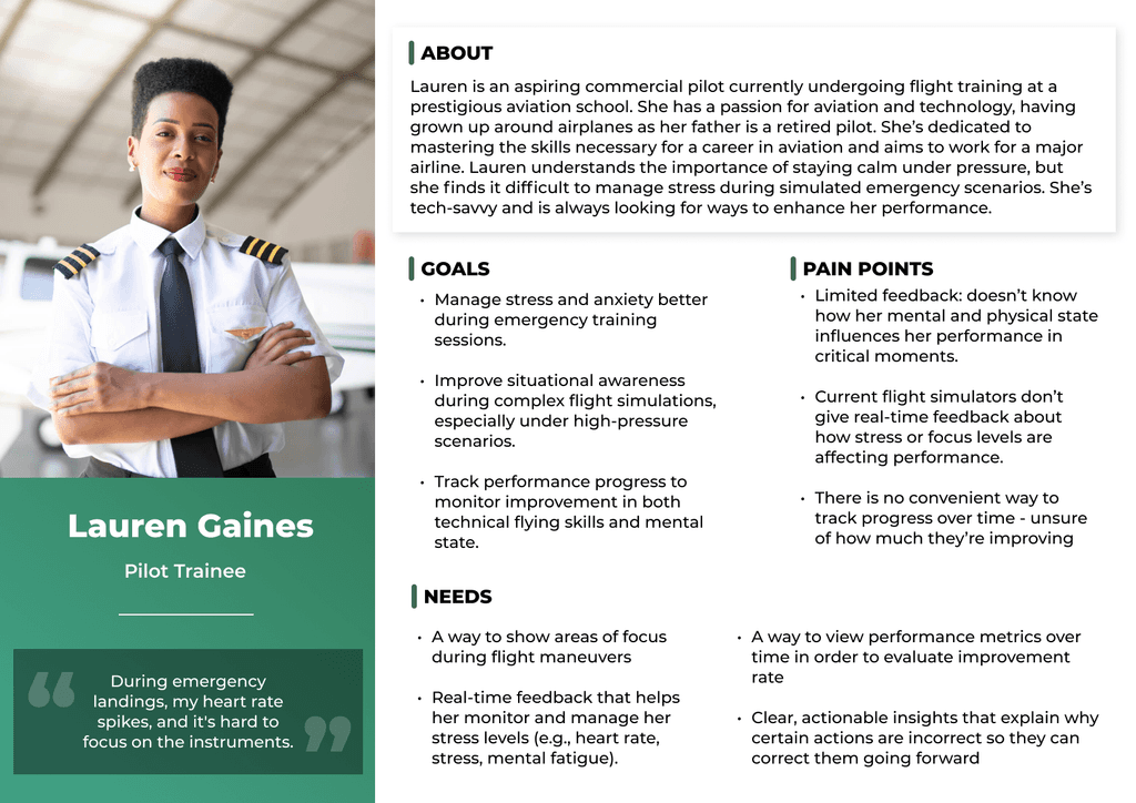
EXO's solution was drawing interest from the aviation sector to evaluate pilot performance during flight simulations. I conducted user interviews with 3 student pilots in training and 3 senior instructors to better understand what pain points existed in the pilot training experience. These insights are summarized below in the form of user personas.
User Personas

With the specific needs of each user group identified, I generated a problem statement to serve as a point of reference for my design.
How might we… design a dashboard that helps identify performance gaps and provides actionable insights to enhance human performance in training exercises?
Competitive Analysis
I used a competitive analysis to learn how other disciplines use dashboards to turn data into actionable insights.
Mobalytics is a performance analytics platform for gamers. It uses data from in-game performance, combined with AI-powered insights, to help players improve their skills. It focuses on providing visualized insights into player performance, such as lane presence, vision control, and character specific statistics, and then translates these into actionable recommendations.
Given that our product is primarily intended for flight simulation training, our focus shifts from gaming to high-stakes, real-world training environments where cognitive performance, focus, and stress management are critical for success. My goal was to learn more about the following areas to help identify how we can stand out from other products in the market:
Data Collection & Analysis
User Interface & Data visualization
Personalized Recommendations
Value Proposition & Differentiation
Data Collection & Analysis
Mobalytics: Limited to collecting game-related data, such as match statistics, KDA (Kills, Deaths, Assists), performance trends, item builds, and map presence. Does not incorporate physiological or cognitive data (like stress, focus, or heart rate).
💡 Opportunity: By incorporating eye-tracking and biosensor data we can provide a more holistic, multi-dimensional analysis. Beyond just showcasing what the trainee is doing, we can show how well they are doing it. We can provide a deeper understanding of how a trainee is reacting during critical simulation moments by analyzing their mental state, focus and stress levels.
User Interface & Data Visualization
Mobalytics: Focusses heavily on visually displaying data through charts, graphs and heat maps. Dashboards are tailored to show key data and a glance. UI emphasizes making complex data accessible and actionable with a clean layout.
💡 Opportunity: I will need to integrate eye-tracking and biosensor data into a dashboard that allows users to quickly interpret how their mental and physical states impact flight performance. Displaying real-time physiological responses such as heart rate variability and stress levels to specific moments during the training simulation could help the user identify when their mental state is negatively impacting their performance.
Visualizing eye-tracking data overlaid on the flight simulator's real-time interface to showcase areas that the trainee is focussing on during specific flight maneuvers or scenarios could help them identify if their focus aligns with critical areas (instruments, navigation, weather patterns, etc.)
Personalized Recommendations
Mobalytics: Provides AI generated insights into how players can improve their gameplay by suggesting areas for improvement, like improving map awareness or better itemization based on their performance history.
💡 Opportunity: Our platform could guide pilots by measuring how their mental and physical state impacts their ability to control the aircraft or handle emergency scenarios. Trainees who tend to lose focus under pressure or show signs of mental fatigue could be offered specialized training to address these issues. For instance, if a trainee’s heart rate spikes during a critical maneuver or if they’re not focusing on important instruments, we could provide immediate personalized feedback—e.g., "Your heart rate is high, suggesting stress. Try slowing your breathing and refocusing on your instruments."
Value Proposition & Differentiation
Mobalytics: Focuses on helping gamers by providing insights based on in-game performance data. The platform excels in analyzing gameplay and offering recommendations for gameplay improvement. It excels in game-focused insights and provides users with visualizations and actionable tips based on gameplay behaviour.
💡 Opportunity: Our platform’s unique value proposition lies in integrating eye-tracking technology and biosensor data to provide real-time insights into how physical and mental states are influencing flight performance. This is particularly important in flight simulation, where cognitive load and the ability to stay focused under stress are vital to safe and effective decision-making.
Key Design Insights

PROPOSED SOLUTION
My idea was a combination of 3 unique tools within a dashboard application.

Live Console - Real-time first-person recording of a training exercise. Offers the ability to experience the training exercise through the lens of the trainee, and flag key moments during the recording for further analysis.

Indicator Replay - Post session replay of a training exercise accessible to both instructors and trainees. Allows for a detailed, second-by-second analysis of trainee's physiological responses during the exercise to evaluate the effects of stress and cognitive load on trainee performance.

3D Scene Replay - Post session replay of a training exercise accessible to both instructors and trainees. Allows for a detailed, second-by-second analysis of trainee's gaze pattern and areas of interest (AOIs) within the environment to evaluate the visual attention of a trainee.
PROTOTYPE
Low Fidelity Wireframes
Starting with wireframes to define functionality & help visualize how elements within each interface would interact with one another.
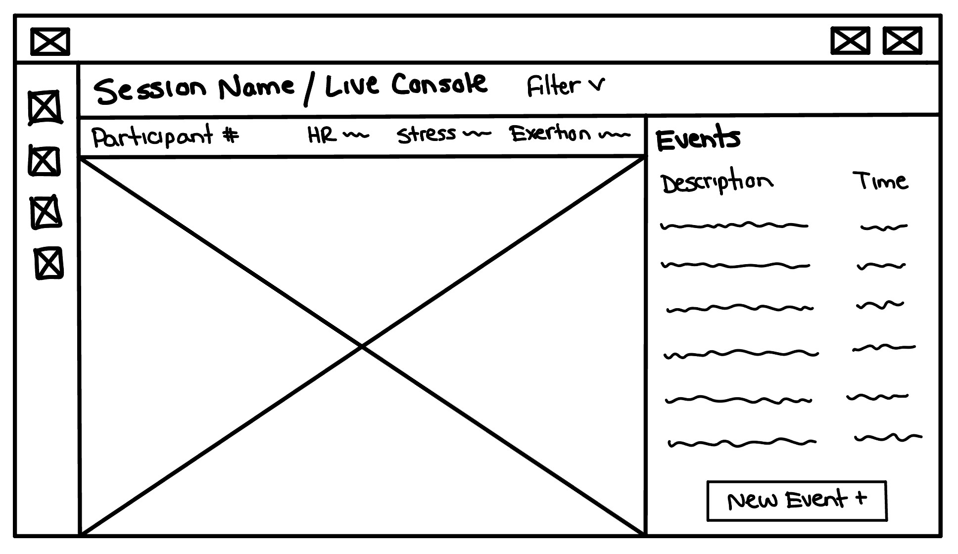
Live Console
During training, the trainer primarily observes the trainee, so I made the video recording the focal point of the interface. To minimize distractions, event flagging is unobtrusive—clicking "New Event" adds a timestamped entry, which can be edited later. These events appear in the Indicator Session Replay for easy reference during session playback.
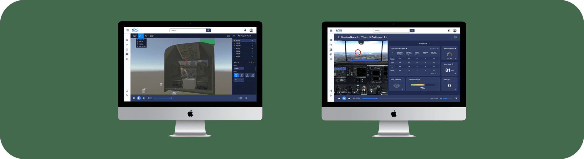
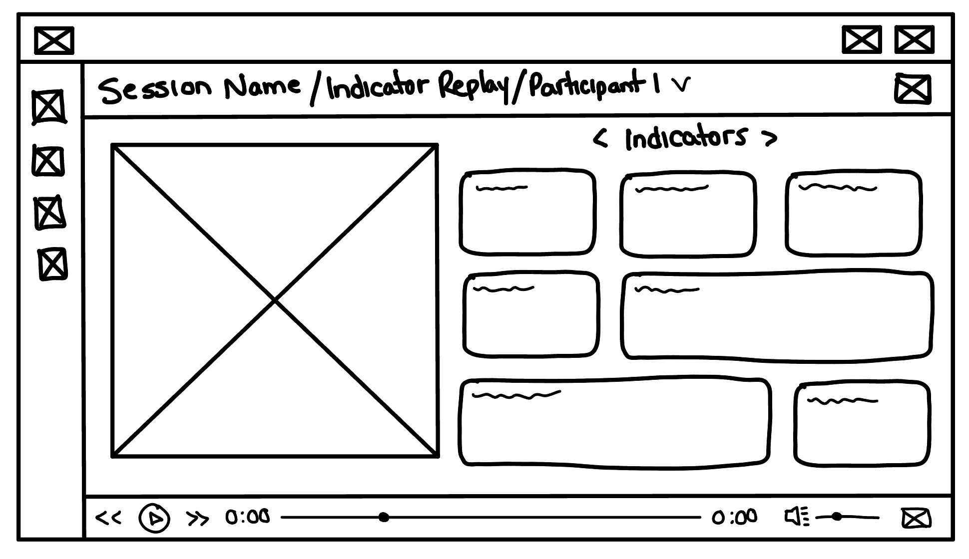
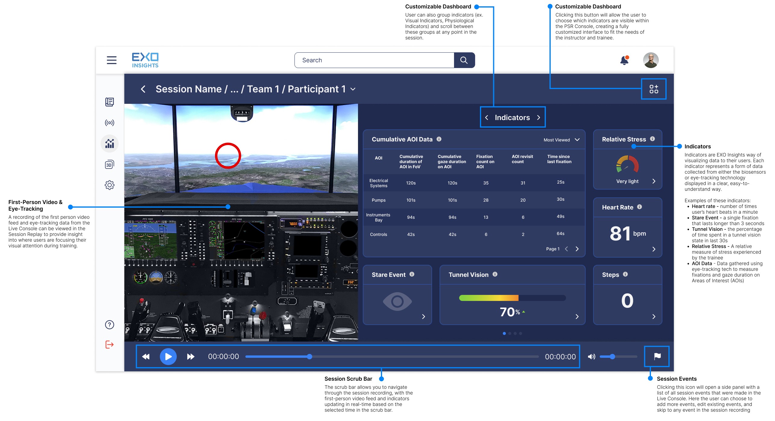
Indicator Session Replay
After the exercise, both trainer and trainee can replay the session with a first-person video and customizable biosensor indicators. This provides a moment-by-moment view of the trainee’s actions and physiological responses, revealing not just what they did, but how they were performing mentally.
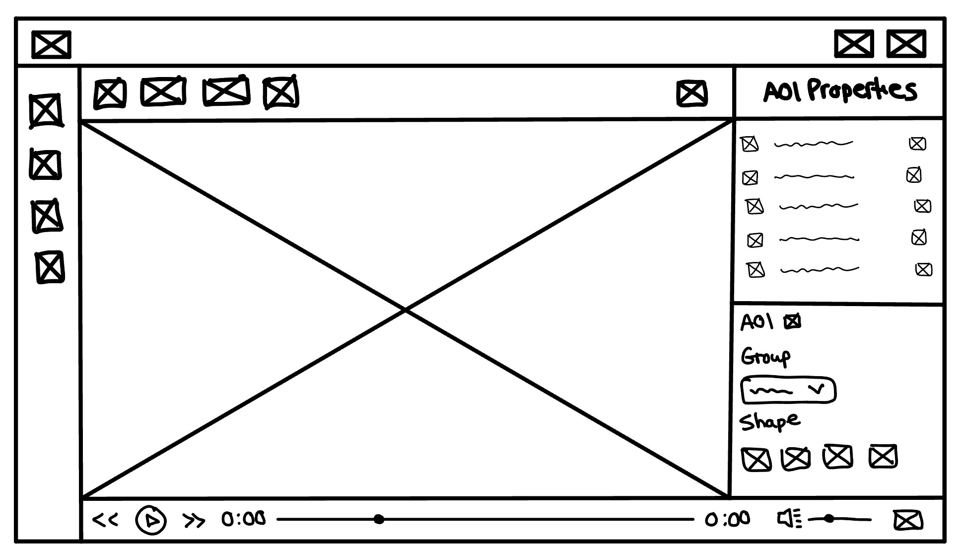
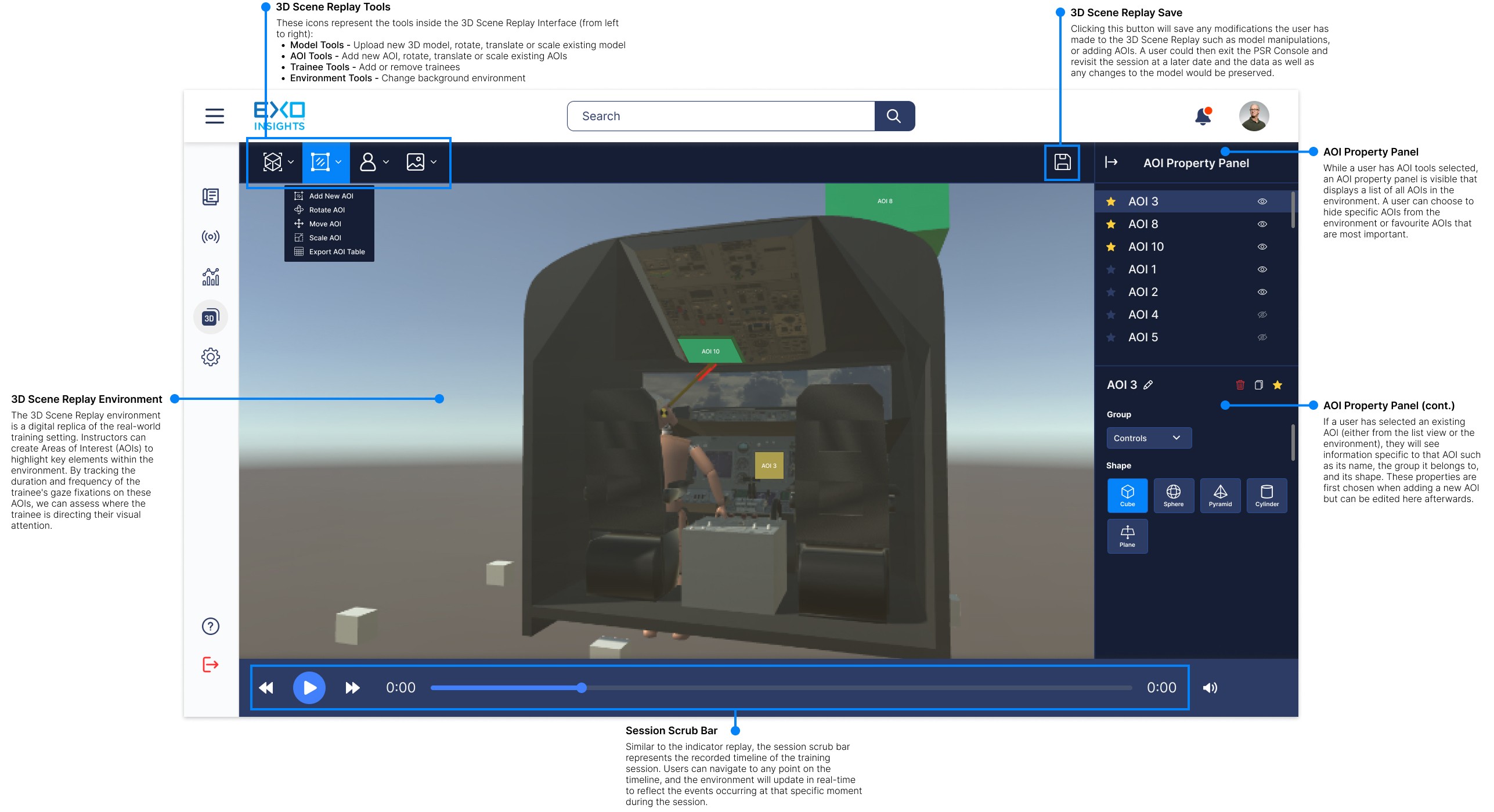
3D Scene Replay
This replay tool offers a 3D view of the training environment for post-session analysis. Trainers can define key Areas of Interest (AOIs), while gaze vectors from eye-tracking data show where and how often trainees looked at these AOIs - helping assess visual focus during the simulation.
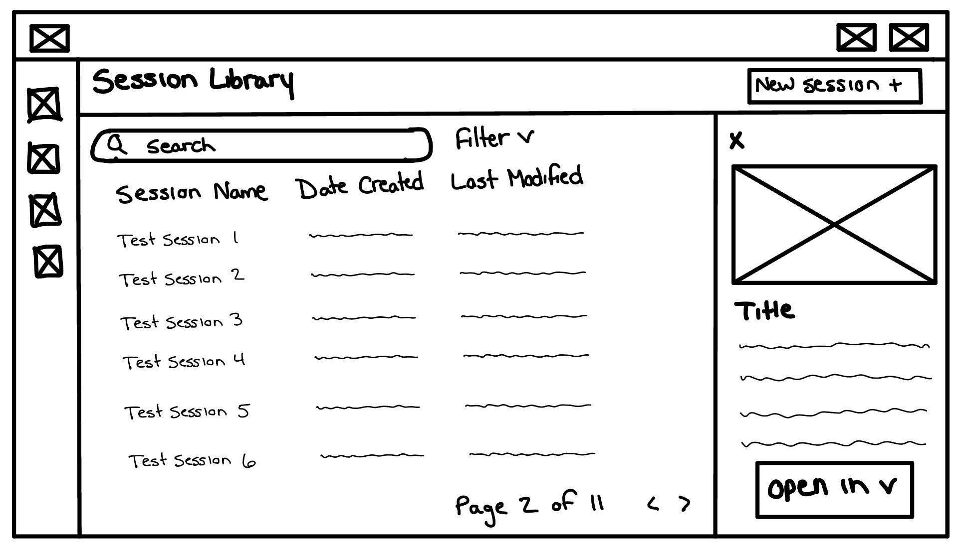
Session Library
Competitive analysis showed that tracking performance over time is key. The session library lets trainers and trainees log, review, and compare past sessions to measure progress. It includes a session list, timestamps, new session creation, and preview cards.
High-Fidelity Designs
With the layout and general structure of each interface complete, I opened up Figma to begin improving the fidelity of the designs.
My goal was to improve the fidelity by incorporating EXO branding, colour styles and iconography.
Live Console

Indicator Replay
3D Scene Replay
Session Library

TEST
To test the effectiveness of the design we were able to partner with a flight school and conduct usability testing with 1 flight instructor and 3 pilot trainees. Prior to testing we equipped each trainee with the biosensors and eye-tracking technology. One at a time the trainee's completed a series of flight exercises and maneuvers using their in-house flight simulators while the data was being collected. After the training session concluded we uploaded the data to the PSR Console and let the instructor and trainee's explore the interface.
Summarized below are some of the larger insights we extracted from the usability testing:
Strengths
✅ The session replay feature is beneficial for post-session debriefs, with event markers improving review efficiency.
✅ Live Console event tagging: Instructors found real-time annotations and event tagging highly useful for immediate analysis.
✅ 3D Scene Replay & AOIs: The ability to create AOIs and analyze fixation patterns helped in assessing focus distribution.
✅ The dashboard provides a clear link between stress levels and performance.
✅ Trainees appreciated the real-time feedback on eye movement and heart rate.
Areas for Improvement
➡️ Implement heatmaps & comparison tools for better visualization.
➡️ Introduce session summary & progress tracking for trainees.
➡️ Enhance event categorization with colour-coded markers.
➡️ Expand AOI features in 3D Scene Replay to support dynamic AOIs.
➡️ Implement automated AI-driven insights for performance improvement
➡️ Conduct a second round of usability testing post-enhancements.
A full Usability Test Report can be viewed here for a more in-depth look at what I learned while testing.
Results & Takeaways
Due to circumstances, I wasn't able to further iterate on the PSR Console; however, post-testing data showed a 35% decrease in missed AOIs and a 20% increase in time spent on critical AOIs. This suggests the dashboard effectively supported flight instructors in assessing trainee visual attention and shows strong potential for future development.
Being the sole designer on this project was both challenging and rewarding and I'd like to share some of the more important things I learned:
UX Advocacy: Being a one-man design team is challenging because you're responsible for both execution and evangelism - you have to do the work while also convincing others why UX matters. Sometimes you spend more time justifying your work than you do actually designing. Whether you're trying to get buy-in from stakeholders or internal team members here are a few tips that I found to be quite useful!
Educate without Overwhelming - Introduce UX concepts gradually. What I found helpful was creating a dedicated UX channel in our Slack and posting UX related content each week for others to read.
Embedding UX in Existing Workflows - Attend standups and planning meetings so UX is considered from the start, try to make UX collaborative, not a separate phase
Create a Design System to Scale UX - Establish basic design guidelines to keep UX consistent, document common UI patterns so engineers don’t reinvent the wheel, and use a component library (even if it starts small) to speed up design work. Make developers lives easier!!
Decision-Making and Prioritization: With no other UX team members to rely on, I became more decisive in choosing research methods and design approaches. I learned to prioritize usability issues based on impact and feasibility and I developed a stronger sense of ownership over the design direction. After being encouraged by the results of our testing session this sense of ownership translated into a boost of confidence in my abilities as a designer.
© 2025 Steven Nydam