WEB APP / DATA VISUALIZATION / DASHBOARD DESIGN / B2B
🏋️ Designing a platform to help fitness enthusiasts stay motivated towards their goals
PROJECT OVERVIEW
ROLE
WeFit is a web-based social workout platform designed to help people establish and maintain a fitness routine by providing them with an experience that keeps them motivated and engaged towards achieving their fitness related goals.
This platform was designed as a personal project during COVID-19 to help myself grow and improve in the areas of visual design (IA, content layout, typography, iconography, imagery, etc.)
Lead Product Designer - Responsible for every aspect of the design process (User Research, Ideation, Prototyping, Testing, IA, Visual Design)
MOTIVATION
COVID changed the workout landscape, how would fitness enthusiasts adjust?
During COVID-19, many non-essential businesses—including gyms and fitness centers—were forced to close in the interest of public health and safety. As a result, individuals had to quickly adapt their workout routines to fit the new reality of at-home fitness.
Having recently established a routine of my own before the pandemic, I found the transition challenging and was curious to understand how others were coping. I set out to explore the evolving landscape of at-home workouts and gain insight into the frustrations and needs of people across a range of fitness backgrounds and experience levels.

My goal was to identify an unmet need within the at-home fitness space and design an interface that enhances and elevates that aspect of the at-home fitness experience.
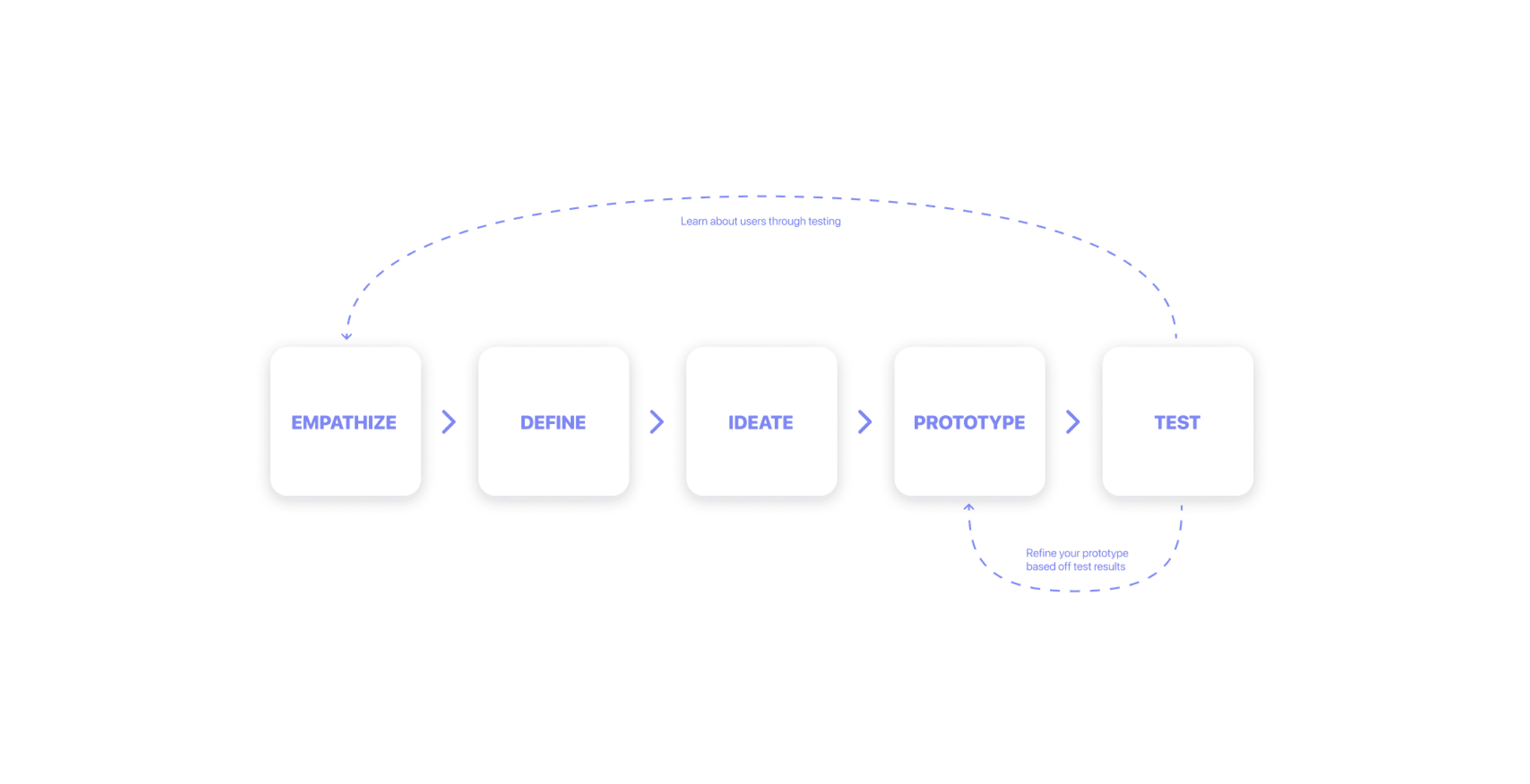
THE PROCESS
For this passion project, I followed the Interaction Design Foundation’s Design Thinking model—a solution-focused approach ideal for tackling complex, undefined problems. Since I began without a clear target within the at-home fitness space, this framework was a natural fit.
EMPATHIZE
I used 4 user research techniques to help develop an understanding of the pain points experienced by fitness enthusiasts.
Surveys
To build empathy with fitness enthusiasts, I used surveys to gather quantitative data on how workout habits changed during the pandemic. The surveys also helped recruit interview participants for deeper insights.
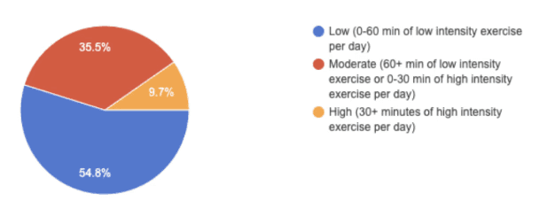
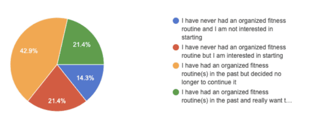
56 Total responses (60% between the ages of 18-25)

Large variation in interests, experience levels and goals - To ensure usability, the final design will need to accommodate a diverse range of users and workout preferences.
User Interviews
To gain deeper insight into the diverse needs revealed in the surveys, I conducted user interviews with participants who volunteered to share their fitness journeys. These conversations helped uncover key pain points, goals, and unmet needs within the at-home fitness experience.
7 User Interviews conducted
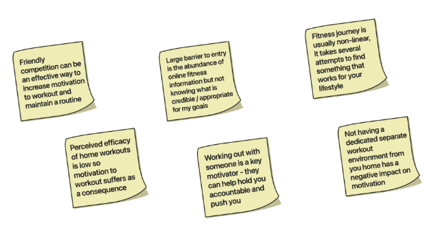
Working out with others is a strong motivation - Many users emphasized the value of a workout partner—whether for friendly competition, accountability, or simply to feel more connected and less alone during their fitness journey.
Literature Reviews
I conducted a literature review to explore evidence-based habit-building techniques, drawing insights from behavioral psychology and fitness research. This helped me understand the key drivers of habit formation—such as consistency, reward systems, and environmental cues.
Among the key take aways I got my from my research is the Hook Canvas found in Nir Eyal’s book Hooked, which outlines a cycle that is created in habit forming products.

The need for an intrinsic reward - Knowing the health benefits of exercise is often not enough to make it a habit, humans also need an intrinsic reward such as reduced stress, or increased energy.
Competitive Analysis
Using competitive analysis to identify and understand the strengths and weaknesses of the competition was crucial in being able to identify gaps in the market. I wanted my eventual solution to be novel and innovative, so I had to first evaluate what’s already being done.
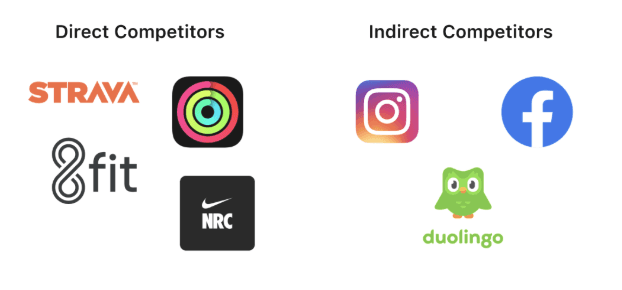
Direct competitors help users stay active through features such as personalized workout plans and routine-building tools. For example, Nike Training Club and Apple Fitness+ offer structured programs tailored to users’ schedules and fitness levels.
Indirect competitors like DuoLingo and Instagram encourages habit formation through daily lessons, and use design patterns that keep users engaged and returning regularly.
There are identifiable opportunities when it comes to motivating the user, and enabling customization based on user preferences.
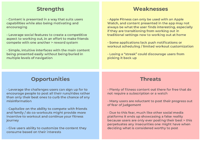
I used a SWOT analysis to identify gaps in the current market, revealing opportunities to improve user motivation, long-term engagement, and customization—key areas to focus on in designing a new product
PROBLEM DEFINITION
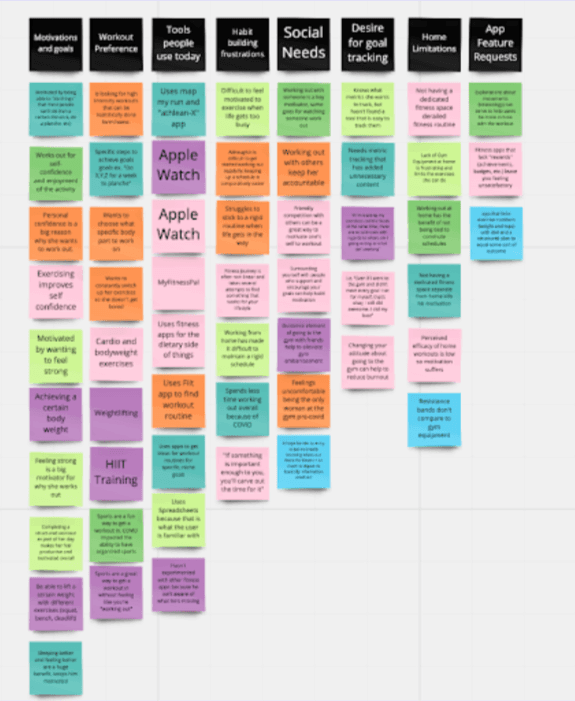
Synthesized user research insights using an affinity diagram to organize data into common themes.
Affinity Diagram
I started by capturing key insights and pain points from surveys and interviews, then organized them into common themes using an affinity diagram. By grouping related feedback on sticky notes, clear patterns emerged, allowing me to identify user behaviors and needs that informed the development of user personas.
Personas
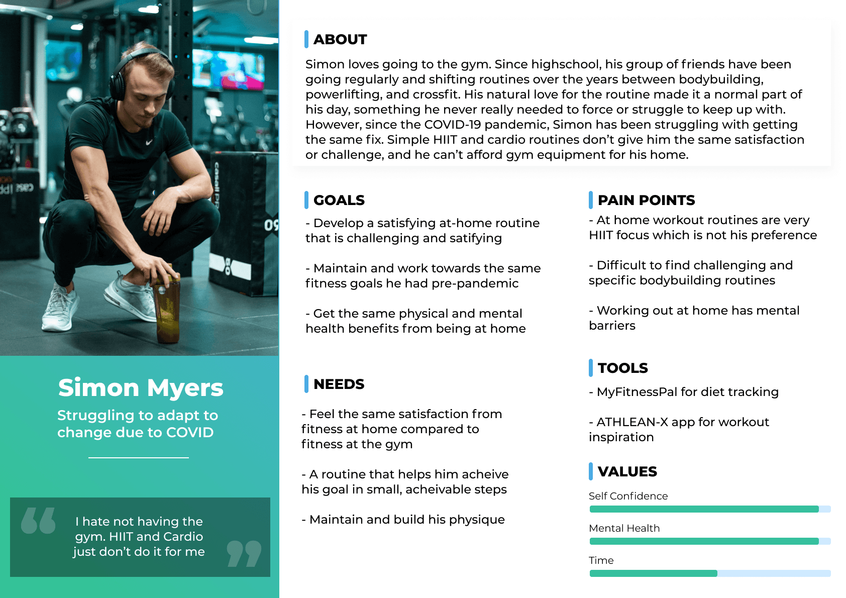
Survey responses revealed a wide-ranging target demographic, with fitness experience and comfort level emerging as key differentiators. I identified three distinct user groups:
People who embraced at-home workouts for their flexibility but struggled with motivation and accountability due to the lack of social connection.
Regular gym-goers who found at-home workouts less satisfying and hard to adapt to.
Beginners who felt overwhelmed by conflicting online information and lacked the guidance to start and stick with a routine.
These insights informed the creation of three user personas at the start of the design process.


The problem…
Combining what I learned from the personas and the other user research methods I could identify problems in the fitness space as a result of COVID-19 that aren’t solved well by existing solutions:

Workout Intensity - People are struggling to mimic the intensity of machine workouts at home without proper gym equipment.
Information Overload - Being unsure of what info is the most credible and applicable due to sheer abundance of online fitness related information.
Maintaining a Fitness Routine - Inability to maintain a fitness routine due to lack of motivation or burnout.
❗️Of these three problems, the inability to maintain a fitness routine seemed the most fit for a digital interface solution so this was the problem I decided to focus on for this project.❗️
Problem Statement
How might we… help fitness enthusiasts stay motivated towards their fitness goals?
Design Ideas & Goals
To design an at-home fitness interface that helps users build healthy workout habits by creating an experience that keeps them motivated and engaged.
Design a solution that encourages users to get started
Design a solution that keeps users engaged
Design a solution that takes minimal effort to use
IDEATION
Used Crazy 8s to generate a large number of ideas in a short amount of time, and then expanded on the most promising ideas.
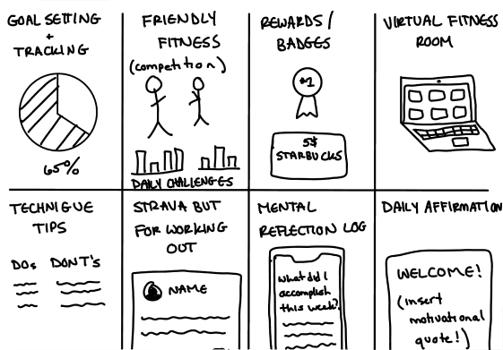

The solution…
The final concept, WeFit, was inspired by the need for motivation and accountability during the pandemic, when working out with friends in person wasn’t possible. Many users missed the social aspect of fitness, which often plays a key role in maintaining a routine. WeFit allows users to join virtual workout rooms with friends or like-minded individuals, creating a shared experience that simulates the energy of a gym. This social, community-driven approach filled a gap not addressed by competitors and opened up space for creative interface design.
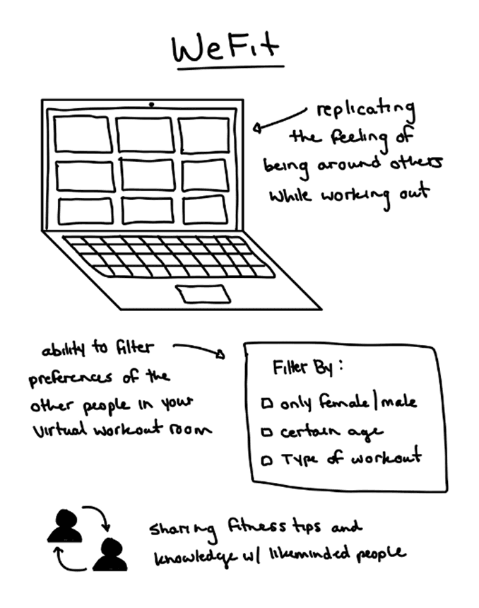
I believe replicating the feeling of being around others while working out would give people the sense of accountability and social support to build and maintain a fitness routine.
Rationale for solution:
Would enable the feeling of being “together” during a time when everyone is feeling extremely isolated
Can give users the ability to filter preferences putting them in the driver seat to curate the experience they want to have
Ability to play into the friendly competition aspect to incentivize users
Potential to provide a platform where users can share and learn fitness tips and knowledge with like-minded people
PROTOTYPING
Low-Fidelity Wireframes
I began designing low-fidelity wireframes focused on minimizing friction from entry to joining a workout room. To keep users motivated, I prioritized reducing clicks and started by prototyping two screens and a modal.
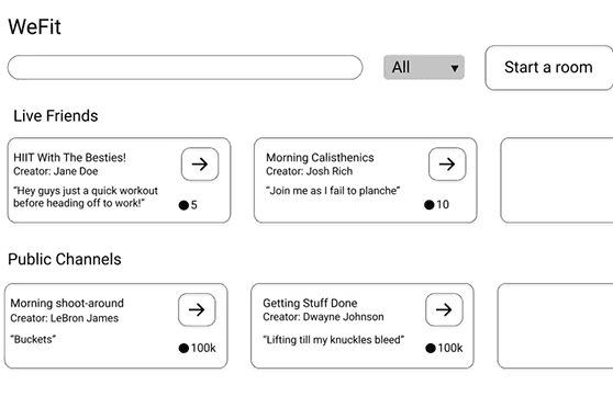
Home Screen
The home screen was designed with all key actions—joining, searching, or starting a room—clearly visible to reduce friction. I used a simplified layout with lots of white space to keep the interface clean and guide users toward starting a workout quickly.
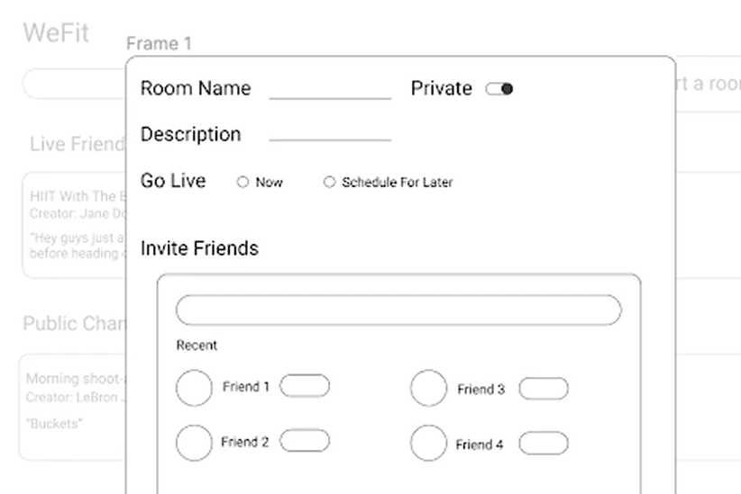
Create a Room Modal
Clicking “Start a Room” opens a simple, intuitive modal where users can name the room, set privacy, add a description, and invite friends—all designed to minimize cognitive load.
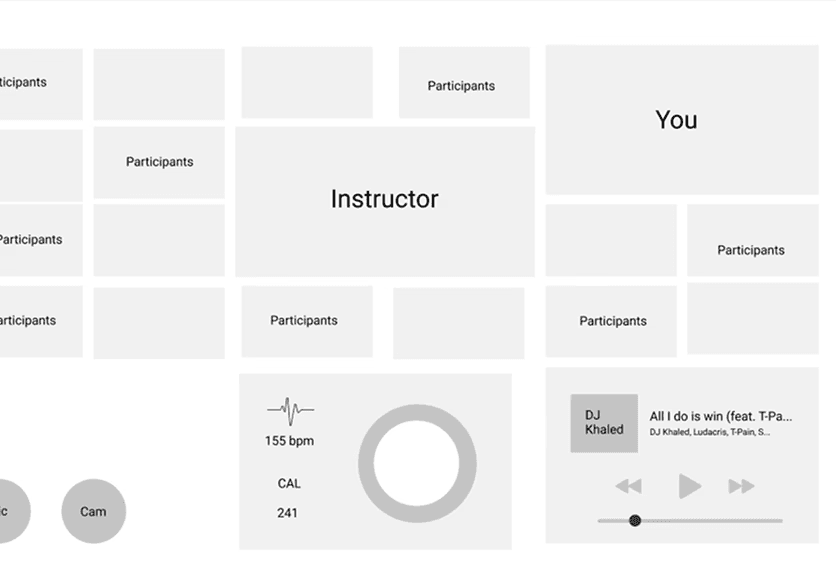
Virtual Workout Room
Since user input on this screen is minimal, most space is dedicated to video feeds to simulate a shared gym experience. A music player and biometrics tile were added to keep users immersed without switching apps.
Medium-Fidelity Prototype
To increase fidelity I focused on typography, iconography and colour use.
I chose SF Pro Display for its clarity—crucial for users navigating the app during high-intensity workouts. Icons were kept flat and familiar to reduce visual clutter and align with user expectations. A calming blue monochromatic colour palette was used to foster trust and comfort, important for a video-based social platform where privacy matters.
Overall, I aimed for a simple, familiar UI that lowers barriers and helps users jump into workouts with friends effortlessly.
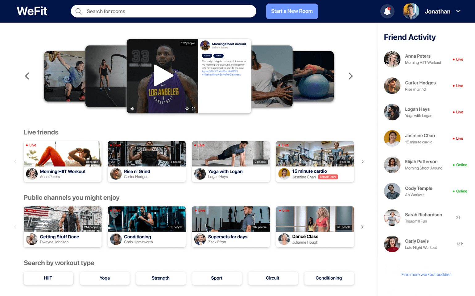
Home Screen
The updated design prioritizes social motivation through layout and hierarchy. Using the proximity principle, the interface groups related elements—friends online appear on the right, while joinable workout rooms are on the left. Thumbnails help users quickly scan and select a room. Since users prefer working out with friends, live friend rooms are placed above public ones for easier access.

Create a Room Modal
The experience is streamlined to minimize clicks and cognitive load. The form follows a logical flow, with quick action buttons to invite suggested friends—making it easier to start a workout with less friction.
Video Options Modal
The modal mimics familiar video call interfaces like Zoom and Google Meet to reduce cognitive effort. A dark background helps create visual hierarchy and focus attention on the modal content.

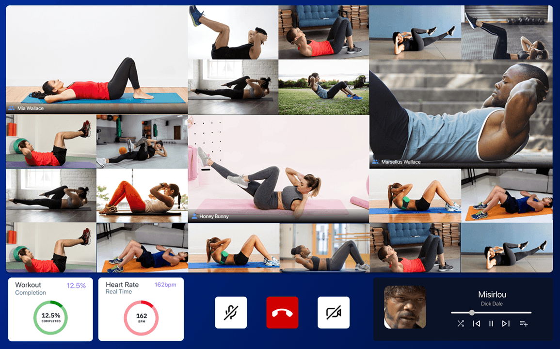
Virtual Workout Room
In-room design prioritizes user preferences: friends appear in large cards, non-friends in smaller ones. Progress tiles boost motivation, and oversized controls minimize errors during active workouts, creating an intuitive, social fitness space.
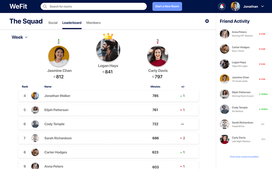
Leaderboards Screen
I added a leaderboard screen to introduce gamification and spark friendly competition among users. The top performer earns a crown, encouraging consistent participation while making workouts more engaging and socially motivating.
TESTING
Card Sorting
I used card sorting to validate information architecture based on user mental models.
I gave participants key interface terms and had them group them intuitively—revealing how well our structure aligned with user expectations.
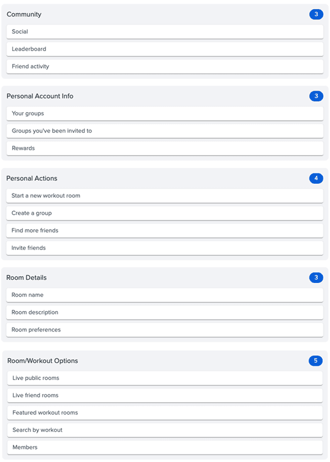
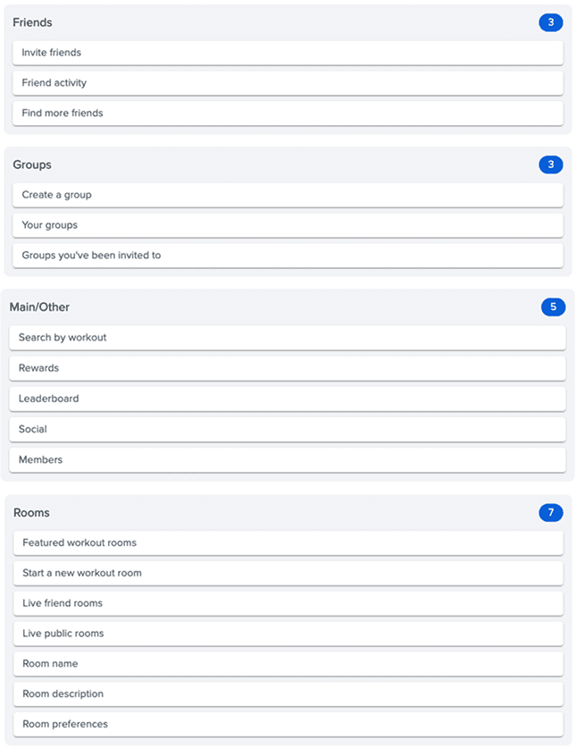
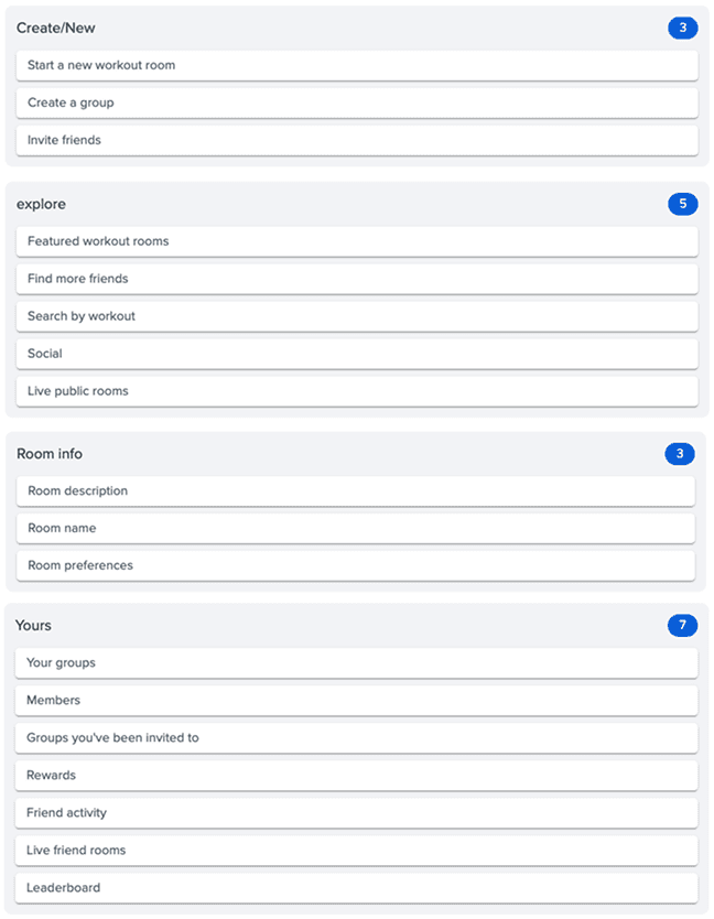
The card sorting results showed that while some groupings (like room details) were consistent, each participant had a unique approach—and none fully aligned with the current interface structure. This suggests a mismatch between user mental models and our design. However, since card sorting lacks visual context like layout and hierarchy, I decided to follow up with usability testing to better assess whether the existing information architecture still supports easy navigation and task completion.
Cognitive Walkthrough
Then I conducted a usability test to help better assess how users navigate the interface.
Card sorting results showed that users’ expectations for content organization differed significantly from my design. Unsure if this was due to poor IA or a lack of context (like hierarchy or proximity), I decided to conduct usability testing to better assess how users navigate the interface.
I built a functional prototype and asked 2 participants to complete three key tasks:
Start a new workout room
Join an existing workout room
Find a group leaderboard
These tasks reflected the core functionality of the platform and helped evaluate whether the current structure supported intuitive use.
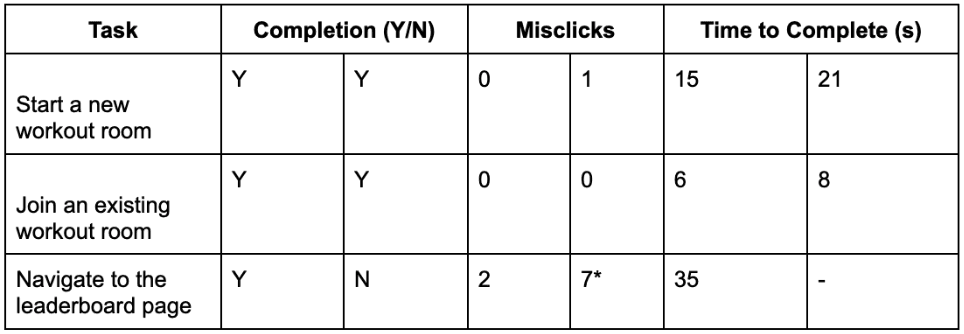
*after struggling for over 60 seconds user 2 gave up on task 3 but made 7 mis-clicks before giving up
From the small sample, users easily completed tasks one and two quickly and with few errors, showing the interface effectively encourages users to start working out with minimal effort—meeting key design goals.
However, task three revealed issues: one user struggled and took much longer, while the other gave up entirely, both with high mis-click rates. This indicates navigating to the leaderboard from the home screen is confusing and needs improvement.
PROJECT TAKEAWAYS
If I were to continue developing this project, one of the key areas I’d revisit is improving access to the 'Groups' page and its associated leaderboard from the home screen. Currently, this part of the platform isn’t as intuitive to find as it should be. Given that one of my primary goals was to keep users engaged—and that friendly competition is a strong motivator for sustained fitness habits—this section deserves more attention and iteration. Additionally, I would expand user testing to increase the reliability and validity of my findings.
Key project takeaways:
Choosing the right testing methods: Selecting appropriate evaluation methods is critical to validating design decisions. I initially used card sorting to assess the information architecture, but its limitations became clear. Without additional context or visual cues, card sorting alone could have led to incorrect conclusions. This experience reminded me to critically interpret test results and support them with complementary methods like usability testing.
Simplicity drives usability: A major lesson was the value of simplicity. Overcomplicating the interface risks confusing or overwhelming users. By streamlining the design and focusing on core functionality, I was able to reduce friction and guide users directly toward starting a workout. A clean, focused UI made the experience more approachable and intuitive.
© 2025 Steven Nydam