


MOBILE APP / DATA VISUALIZATION / PERSONAL PROJECT / B2C
🧗 Reimagining the Sports Stats Experience for New and Casual Fans
PROJECT OVERVIEW
ROLE
This project explores how performance data can be reimagined to make professional sports statistics more approachable and engaging for new and casual fans.
The concept focuses on translating complex performance metrics into intuitive visual summaries—such as performance ratings, trends, and badges— to help fans not just see the numbers, but understand the story behind them.
Lead Product Designer - User Research, Interaction Design, Visual Design, Information Architecture, Usability, Prototyping & Testing
IMPACT

Made Sports Stats More Digestible
Simplified complex performance data into layered, visual-first insights that are easy for casual and new fans to understand

Increased Fan Confidence and Engagement
Helped fans quickly interpret performance and feel confident discussing games with friends

Bridged Context and Data
Turned raw numbers into meaningful narratives, highlighting why a player performance matters in a way that’s intuitive
THE PROCESS
This project followed BrainStation’s Design Thinking process, which I applied as part of my UX/UI Design Certification coursework.
The approach emphasized empathizing with users, defining clear problem statements, and rapidly iterating through ideation, prototyping, and testing. Working within this structured framework allowed me to validate design decisions early, incorporate feedback quickly, and refine the experience with a strong focus on usability and clarity for new and casual sports fans.
USER RESEARCH
As performance statistics explode across sports, they're continually delivered through interfaces that assume expert-level sports literacy.
By conducting exploratory user interviews with 5 sports fans with varying levels of fandom and exposure to sports statistics, I came to understand existing pain points new and casual sports fans have related to sports statistics.


The overwhelming volume and complexity of sports stats creates a barrier to entry for new and casual fans.
PROBLEM DEFINITION
I used affinity mapping to synthesize research insights into common themes.
I started by identifying user goals (green), behaviours (yellow), pain points (red), and opportunities (blue), then affinity mapped them into common themes to help identify key problem areas, unmet needs, and strategic design opportunities.

Prioritizing problem statements by comparing impact and satisfaction
Drafting personas to gain an understanding of how the needs of fans differ based on their level of fandom and exposure to stats.
I also considered how a fan’s level of fandom and exposure to statistics shaped their needs. Casual fans often recognize common metrics but lack context, while new fans are typically unfamiliar with stats altogether, but curious to learn. This led to the creation of two distinct personas—one casual fan and one new fan—with shared goals but unique needs that helped informed the final design.


The Problem
New and casual sports fans often find it difficult to understand player stats, advanced metrics, and in-game analytics. The information currently available—whether on broadcast graphics, league apps, or sports websites—is often overwhelming, jargon-heavy, and requires prior knowledge to interpret.
Prioritizing problem statements by comparing impact and satisfaction
How Might We…
Make sports stats more digestible, visual, and meaningful for casual fans so they can better understand player performance and feel more confident discussing games with others?
IDEATION
Using Crazy 8s to generate possible solutions — fast!
I started with a crazy 8s exercise using the "How Might We…" statement as a foundation for ideation. I focused on generating ideas that supported the key themes identified in the affinity mapping exercise — visual summaries, context, progressive depth and social confidence.

Then I combined elements of the most promising ideas from the Crazy 8s exercise to establish my proposed solution.
The Proposed Solution…
A mobile-app that transforms complex sports stats into a visually engaging, social experience using layered performance cards that help fans better understand performance at a glance, follow storylines, and confidently participate in sports talk with others.


To help define the screens I would need to prototype I created two user flows outlining the path a user would take to complete a task.


Each of the identified tasks corresponds to a user goal from the personas I created earlier in the design process. The next step was to start sketching some of the necessary screens for each user flow.
LOW-FIDELITY PROTOTYPING
Sketches
I started with sketches to help me explore layout ideas, information architecture, and iterate on different ways of visualizing data.
Each of the identified tasks corresponds to a user goal from the personas I created earlier in the design process. The next step was to start
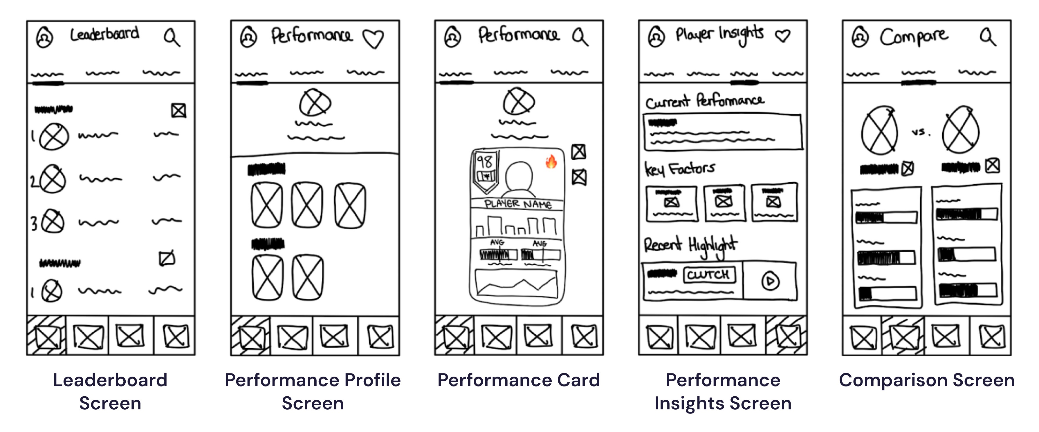
Wireframes
Improved fidelity using wireframes to solidify the content layout, hierarchy and core functionality without the influence of visual styling.

TEST
Wireframe User Testing
Before moving to a higher-fidelity I wanted to validate the core features of my design.
I conducted user testing with 4 sports fans of diverse levels of fandom and exposure to sports stats. My goal was to learn how effective my early-stage design addressed the six prompts below. Most importantly, do the visual performance cards provide value?

I learned that I needed to revisit the execution of the performance card concept.

Visual Clarity & At-a-Glance Understanding - Fans loved the visual-first performance cards and felt they made complex stats easy to understand at a glance by using simplified summaries to highlight what matters most.
Clear Strengths, Weaknesses and Narratives - Users found it easy to quickly identify a player’s strengths and weaknesses through the performance levels - helps fans grasp the broader story behind the numbers without needing deep knowledge of stats.

Content Overload - Having multiple cards for different performances (season, career, series, etc.) created cognitive friction. Users had to repeatedly tap in and out of cards to compare timeframes, which disrupted flow and made exploration feel effortful.
Space Constraints - Since each card has fixed dimensions, information density was constrained — forcing trade-offs between clarity and completeness. Difficult to display high volumes of stats at the "deeper" level.
Insight — fans don't want separate summaries, they want a single place to understand a player's performance and control what context they are viewing.
MID-FIDELITY PROTOTYPING
First-Iteration Prototype
For the first iteration prototype, the focus was iterating on the performance card design, while adding visual styling such as colours, iconography, and typography to improve the design fidelity.
The Solution — consolidate cards into a single, scrollable performance profile.
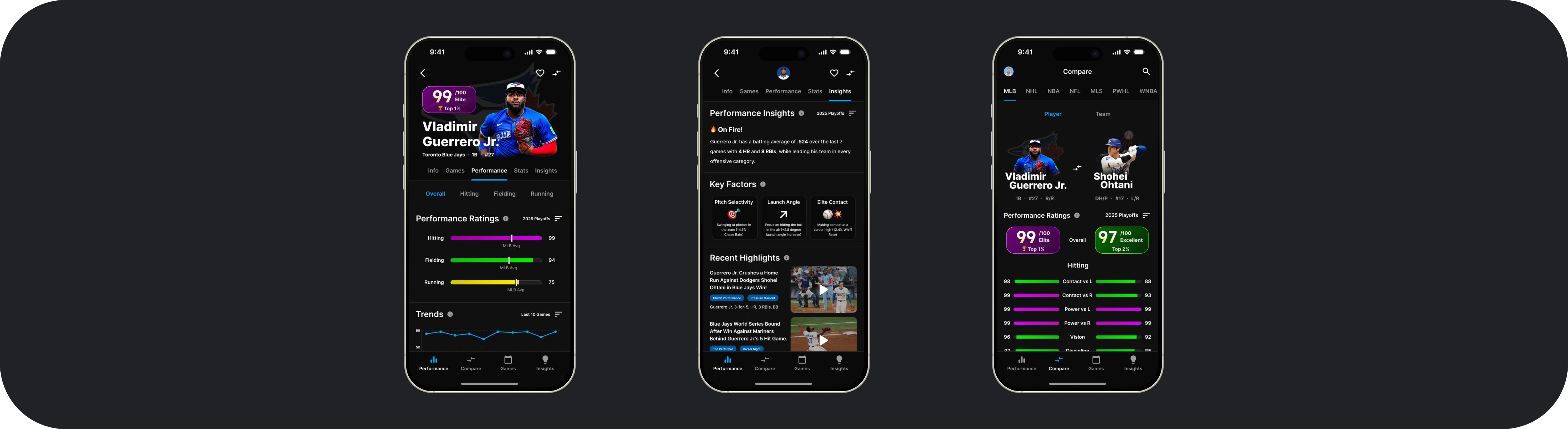
Player Performance Profile
Performance Profile Filter

Performance Insights
Performance Comparison

Performance Leaderboard

TEST
First-Iteration User Testing
Focus on identifying usability issues, or points of user friction with the first-iteration prototype.
I conducted user testing with 4 more sports fans. My goal was to identify any points of friction, or usability issues with the first-iteration prototype. I created a series of tasks for users to complete while they talked aloud their experience:
Navigate to Vladimir Guerrero Jr.’s player profile page
Filter for his 2025 playoff performance
Learn more about his performance during the 2025 playoffs
Get insight on “why” he was so good
Compare his performance to the best player in the world (Shohei Ohtani)
HIGH-FIDELITY PROTOTYPING
Second-Iteration Prototype
For the second iteration prototype, my focus was on addressing the usability issues and friction points that were identified during testing. A summary of these changes are provided below:
Player Performance Profile
Performance Badges

Performance Insights
Performance Comparison

NEXT STEPS & TAKEAWAYS
Next Steps…. expand on usability testing.
I need to conduct usability testing with a larger, more diverse group of casual and new sports fans to validate comprehension, confidence, and engagement.
Also, for the sake of this project I focused primarily on player performance within baseball, ideally I would like to expand the platform to include many sports, and team performance in addition to player performance.
What I learned…
Some key takeaways from this project were:
Designing for understanding is different than designing for information
I learned that presenting data clearly is not the same as making it meaningful.
Users don’t struggle because data is unavailable — they struggle because it lacks context.
Translating numbers into narratives requires prioritization, hierarchy, and explanation — not just visualization.
Reducing Cognitive Load Is a Strategic Design Decision
More data does not equal more value.
The hardest part of this project was deciding what not to show.
Simplicity required intentional constraints and ruthless prioritization.
Layered information architecture can support both beginners and advanced users without overwhelming either.
Designing for Multiple Personas Is Challenging
Balancing the needs of:
Curious-but-intimidated fans
Confident-but-selective fans
Required layered access rather than separate experiences.
A single solution must scale across different levels of sports literacy.
© 2026 Steven Nydam